Yishi Lin

  • Home

  • Archives

  • Dataset

  • Blog

  • Categories

  • Search

Visualizing Location-based online social networks

Posted on 2016-12-05 In Network Science , Visualization

Goal

  • Explore location-based datasets from SNAP (using loc-gowalla in this post)
  • Learn how to draw maps using R (from StackOverflow and Google haha)

Downloading the dataset

Download the dataset, including the social network and check-in logs. Save the introduction of this dataset.

1
2
3
4
5
6
7
8
9
10
11
12
13
14
#!/bin/bash

url_prefix="https://snap.stanford.edu/data/bigdata/communities"
dir="raw"

mkdir -f $dir

wget http://snap.stanford.edu/data/loc-gowalla_edges.txt.gz -P ${dir}/
wget http://snap.stanford.edu/data/loc-gowalla_totalCheckins.txt.gz -P ${dir}/

gzip -d ${dir}/loc-gowalla_edges.txt.gz
gzip -d ${dir}/loc-gowalla_totalCheckins.txt.gz

wget http://snap.stanford.edu/data/loc-gowalla.html

Visualization

I put all codes at the end of this post.

At first glance

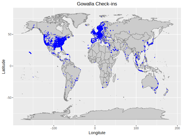
I first visualize check-in logs in a map (see ref. [1]). Because there are too many check-in logs, I only randomly sample some to them to visualize. The output is as follows. We can see that most logs are check-ins to the US or countries in Europe.
Mapping GPS to detailed locations

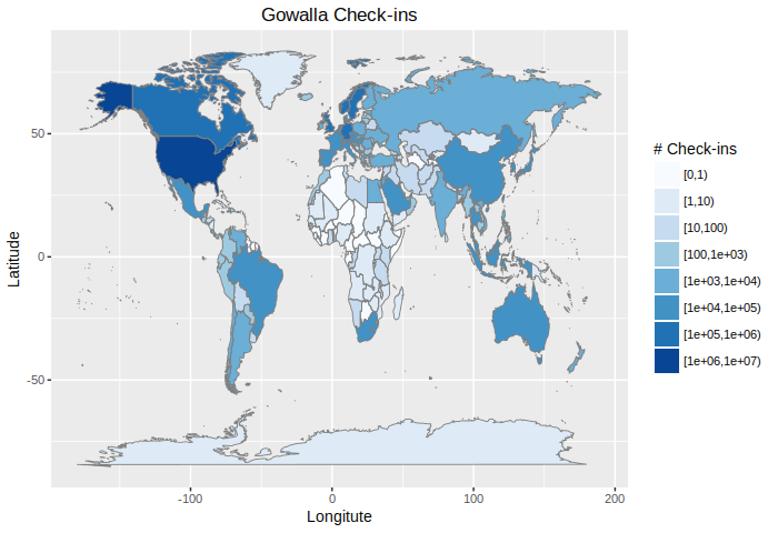
Mapping country codes to check-ins is done by the method in [2]. For simplicity (because I am lazy), I only keep the country name of each check-in. Countries with most check-ins are listed as follows.

1
2
3
4
5
6
7
    country    Freq
177 USA 3437564
161 Sweden 712482
59 Germany 348341
173 UK 265405
124 Norway 143066
31 Canada 120534

Visualizing check-ins of each country/area

Check-ins have been labeled by their corresponding country/area in the previous step. I visualize the total number of check-ins of each country. The results are as follows.
Visualizing check-ins of the US

Because more than half of the check-ins are map to locations in US. We visualize the number of check-ins to each state of the US. Only lower 48 states and Washington, D.C. are shown in the figure. (The “map_data(‘state’)” only contains lower 48 states + D.C.) The results are as follows.
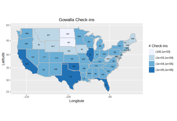
In fact, top-5 states with most check-ins are as follows.

1
2
3
4
5
6
7
        region   Freq
42 texas 811184
4 california 567009
9 florida 176878
12 illinois 117612
35 oklahoma 104459
10 georgia 89367

Codes

Codes are as follows. I hope they are self explanatory.

1
2
3
4
5
6
7
8
9
10
11
12
13
14
15
16
17
18
19
20
21
22
23
24
25
26
27
28
29
30
31
32
33
34
35
36
37
38
39
40
41
42
43
44
45
46
47
48
49
50
51
52
53
54
55
56
57
58
59
60
61
62
63
64
65
66
67
68
69
70
71
72
73
74
75
76
77
78
79
80
81
82
83
84
85
86
87
88
89
90
91
92
93
94
95
96
97
98
99
100
101
102
103
104
105
106
107
108
109
110
111
112
113
114
library(data.table)
library(ggmap)
library(maps)
library(mapdata) # contains the hi-resolution points that mark out the countries.

# Set working dictionary and create output folders ------
if (Sys.getenv("RSTUDIO") == "1") {
setwd(dirname(rstudioapi::getActiveDocumentContext()$path))
}
if (!dir.exists("visualization")) {
dir.create("visualization")
}
if (!dir.exists("checkin")) {
dir.create("checkin")
}

# Load the data ------
checkins <- fread("raw/loc-gowalla_totalCheckins.txt")
names(checkins) <- c("uid", "time", "lat", "long", "location_id")
checkins <- subset(checkins, long >= -180.0 & long <= 180.8 & lat >= -90.0 & lat <= 90.0)

# Global maps (points) ------
global.sample <- checkins[sample(nrow(checkins), 50000), ]
global.plot <- ggplot() +
borders("world", colour="gray50", fill="gray80", size = 0.3) + # create a layer of borders
geom_point(aes(x=global.sample$lon, y=global.sample$lat),
color="blue", size = 0.08) +
labs(x = "Longitute", y = "Latitude", title = "Gowalla Check-ins") +
theme_gray(base_size = 10) +
theme(plot.title = element_text(hjust = 0.5))
global.plot
ggsave(plot = global.plot, "visualization/loc_gowalla_world.png",
width=6.4, height=4.8, dpi=100)

# GPS -> country/region/city ------
## map to locations
checkins[, "country_name" := gsub(":.*", "", map.where(x=long, y=lat))]
fwrite(checkins[, c("uid", "country_name")], file = "checkin/checkins.txt",
row.names = F, col.names = F, sep = " ", quote = T)

## count the number of check-ins to each country
checkins.cnt <- as.data.frame(table(country = checkins[, country_name]))
checkins.cnt <- checkins.cnt[with(checkins.cnt, order(-Freq)), ]
fwrite(checkins.cnt, file = "checkin/checkins_cnt.txt",
row.names = F, col.names = F, sep = " ", quote = T)

# Global map (number of counts) ------
## get the map
world.map <- map_data('world')
world.map <- merge(world.map, checkins.cnt, by.x = 'region',
by.y = 'country', all.x = T)
world.map <- world.map[order(world.map$order),]

## cut frequency by log intervals
world.map[is.na(world.map$Freq), ]$Freq <- 0
world.map$Freq.cut <- cut(world.map$Freq,
c(0,10**(0:log(max(world.map$Freq)))),
include.lowest = T,
right = F)

## plot
world.plot <- ggplot(data = world.map, aes(x = long, y = lat, group = group)) +
geom_polygon(aes(fill = Freq.cut)) +
borders("world", colour="gray50", size = 0.3) + # create a layer of borders
scale_fill_brewer('# Check-ins') +
labs(x = "Longitute", y = "Latitude", title = "Gowalla Check-ins") +
theme_gray(base_size = 10) +
theme(plot.title = element_text(hjust = 0.5))
world.plot
ggsave(plot = world.plot, "visualization/loc_gowalla_world2.png",
width=7, height=4.8, dpi=100)

# USA map ------
## get region of each check-in
us.checkins <- subset(checkins, startsWith(country_name, "USA"))
us.checkins[, "region" := gsub(":.*", "", map.where("state", x=long, y=lat))]
us.checkins <- us.checkins[!is.na(region)]
fwrite(us.checkins[, c("uid", "region")], file = "checkin/checkin_us.txt",
row.names = F, col.names = F, sep = " ", quote = T)

## get region cnt
us.region.cnt <- as.data.frame(table(region = us.checkins[, region]))
head(us.region.cnt[order(us.region.cnt$Freq, decreasing = T),])
fwrite(us.region.cnt, file = "checkin/checkins_us_cnt.txt",
row.names = F, col.names = F, sep = " ", quote = T)

## get the map
us.map <- map_data('state')
us.map <- merge(us.map, us.region.cnt, by = 'region')
us.map <- us.map[order(-us.map$order),]

## cut frequency by log intervals
us.map$Freq.cut <- cut(us.map$Freq,
c(0,10**(0:log(max(us.map$Freq)))),
include.lowest = T,
right = F)

## get names of each region
states <- data.frame(state.center, state.abb)
states <- states[states$state.abb != "AK" & states$state.abb != "HI", ]

## plot
us.plot <- ggplot(data = us.map, aes(x = long, y = lat, group = group)) +
geom_polygon(aes(fill = cut(Freq, 10**(0:log(max(Freq)))))) +
geom_path(colour = 'gray') +
scale_fill_brewer('# Check-ins') +
coord_map() +
geom_text(data = states, aes(x = x, y = y, label = state.abb, group = NULL), size = 2) +
labs(x = "Longitute", y = "Latitude", title = "Gowalla Check-ins") +
theme_gray(base_size = 10) +
theme(plot.title = element_text(hjust = 0.5))
us.plot
ggsave(plot = us.plot, "visualization/loc_gowalla_us.png",
width=7, height=4.8, dpi=100)

References

  1. R Beginners – Plotting Locations on to a World Map https://www.r-bloggers.com/r-beginners-plotting-locations-on-to-a-world-map/
  2. Assign Country Code to Tweets Based on GPS Coordinates https://zacharyst.com/2016/02/12/when-twitter-doesnt-give-a-country-code/
  3. Administrative regions map of a country with ggmap and ggplot2 (Visualizing unemployment rate) http://stackoverflow.com/questions/17723822/administrative-regions-map-of-a-country-with-ggmap-and-ggplot2
My LeetCode Notebook
WordPress Building Notes
  • Table of Contents
  • Overview
Yishi Lin

Yishi Lin

24 posts
11 categories
25 tags
RSS
GitHub E-Mail
  1. 1. Goal
  2. 2. Downloading the dataset
  3. 3. Visualization
    1. 3.1. At first glance
    2. 3.2. Mapping GPS to detailed locations
    3. 3.3. Visualizing check-ins of each country/area
    4. 3.4. Visualizing check-ins of the US
  4. 4. Codes
  5. 5. References
© 2013 – 2021 Yishi Lin
Powered by Hexo v3.9.0
|
Theme – NexT.Gemini v7.3.0